
A is for April
7th April, 2011
by Blondina Elms Pastel.Reading time: about 1 minute.
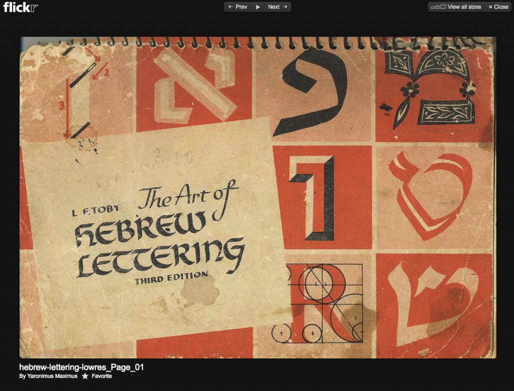
The best Hebrew lettering book I have seen so far. I would love to get my hands on one of these books—for now, I will have to settle for Yaronimus Maximus’ Flickr uploads.
::::::::::::::::::: click to see more pics ::::::::::::::::::::
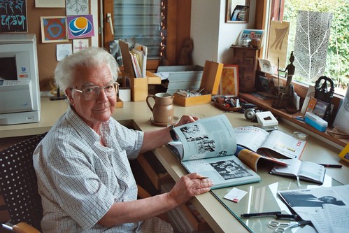
Photographed by Henk Gianotten in 2003
I really like this picture. It speaks more than a thousand words.

A beautiful day with a beautiful ending.

Michael Twyman’s Typographic Delights continues … today we had the pleasure of looking at Puffin editions from the 1930’s to the late 1940’s. The most remarkable thing I noted was the vibrancy of colour and the detail of the illustrations. Another point of note was that nearly all of these publications were in landscape format with the exception of Music Time which was in portrait.
::::::::::::::::::: click to see more pics ::::::::::::::::::::