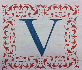
A fascinating world that still holds many unanswered questions and one that deserves further study as it pertains to the history of the book, the history of letterforms and the history of reproduction.
Recruited in 2015 as one of the research students at the Atelier National de Recherche Typographique (ANRT) in Nancy, France, I had the opportunity to be baptised into the waters of stencilled liturgical books, and ever since, I have decided to dive deeper, to be able to tell the story of these beautiful, industrious works. A fascinating world that still holds many unanswered questions and one that deserves further study as it pertains to the history of the book, the history of letterforms and the history of reproduction (printing).
Eric Kindel, with whom I have had the privilege and pleasure to discuss this topic of the stencilled letter and more particularly, stencilled liturgical books—has written much on the method of stencilling and the stencilled letter—is a must read for anyone interested in this subject. It is in fact Kindel who guided me towards my encounter with Claude-Laurent François.
For months I had been waiting for the 24th August, 2016 to finally meet Claude-Laurent François who has been conducting research on the works of stencilled liturgical books since 1994. Waiting to discover these special books he had spoken about and had kindly arranged for their viewing. A pair is located at Notre dame de Ganagobie, France, and the other at Sainte-Tulle, France. Very different but similar works dating from the 18th century. These aforementioned works have been featured in François’ text ‘Les Écritures Realises au Pochoir’ published in Yves Perrousseaux’s Histoire de l’Ecriture Typographique Le XVIIIe siècle, (Vol. II, pp. 139–160, Italy, 2010). This text features the pair found at Ganagobie.
A work of reference on the subject of stencilled choir books is the text by Gotthelf Fischer von Waldheim, ‘Uiber ein in der Mainzer Univeritätsbibliotheck befindliches durch Belch geschriebenes Chorbuch’ in Beschreibung einer typographischer seltenheiten, (Vol. 3, Mainz, 1800–1804). Hellmut Rosenfeld, who referred to Waldheim in his text ‘Der Gebrauch der Schablone für Schrift und Kunst seit der Antike und das schablonierte Buch des 18. Jahrhunderts’ in Gitenberg-Jahrbuch (pp. 71–84, 1973) tells us in his story that the method of stencilling was first implemented in France by religious orders as it was well suited to monastic ideals and each member of the monastery could participate. However, the fact that some of these works are signed, suggests that each member may not have participated and that this work was done by those trained in the art of stencilling (as for manuscripts, there were scribes appointed to carry out that task). I would also like to suggest that various religious orders operated differently as it can be noticed, some books are less precisely executed than others. I hope to discuss this in another feature.
A pair of stencilled liturgical books
used by the Minimes monastery of Marseille

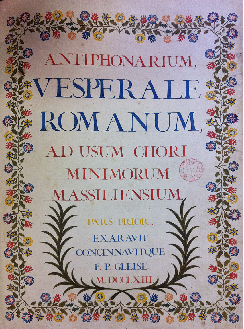
The title pages of the works conserved in the monastic library at the Ganagobie monastery tell us a few things about these antiphonals. That of the 1st antiphonal (see Figure 1) tells us it is just that ‘the first part’; with the words pars prior stencilled in yellow in capitals. Just below we see, Exaravit Concinnavitque telling us the method of production used, which can be loosely interpreted as ‘devices for inscribing’. Both volumes show this kind of information on the title pages and are both signed. The two volumes use heavy weight laid paper which perhaps lends to the vividness of the colour that greets us as we peruse the pages.
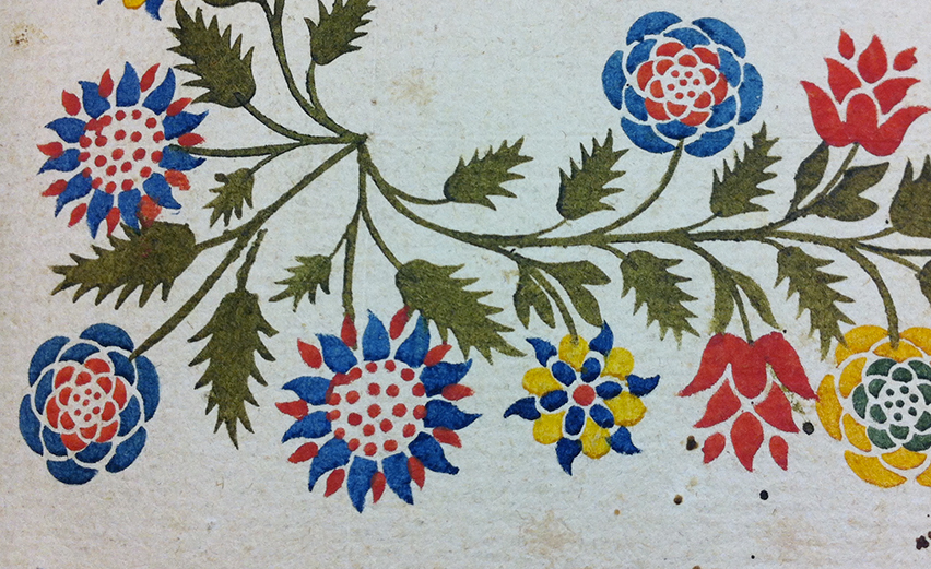
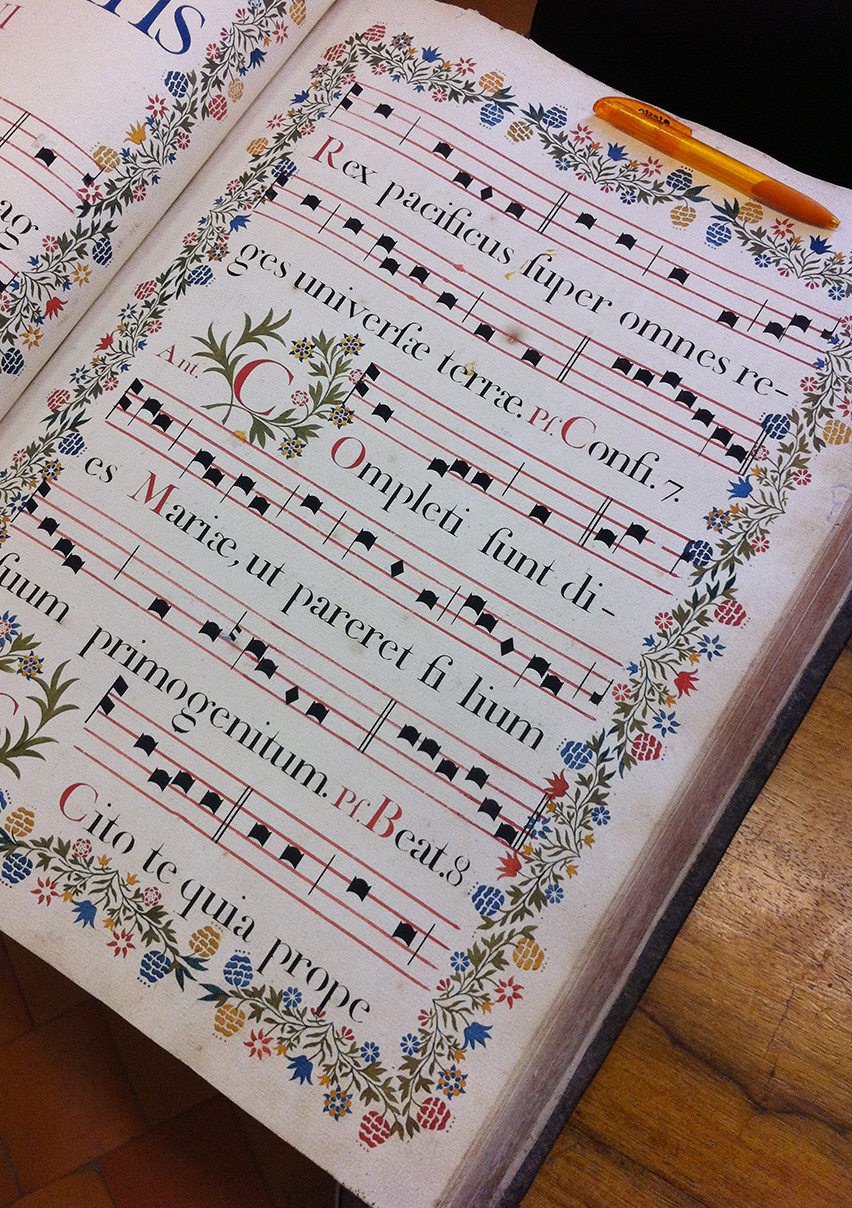
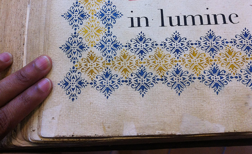
Two things in particular struck my attention in these works. The exceptional quality of the decorative elements and the crispness of the stencilled letterform (giving some indication of the quality of the stencil from which it was stencilled) as compared with other stencilled liturgical books consulted. There is also a certain simplicity—or perhaps the better word might be soberness—found in these two volumes of stencilled antiphonals. This is clearly not the work of an amateur, it brings to mind the description of the work of Johann Claudius Renard by Fischer Von Waldeheim, who expressed his fascination with the quality of Renard’s stencilled works. Waldeheim tells us in his notes that Renard received in 1747 a recommendation from the Chancellery of Banz, not only for his ability in the craft of stencilling but also for instructing members of religious communities in this craft. Is it possible that the author of these works was a student of Renard?

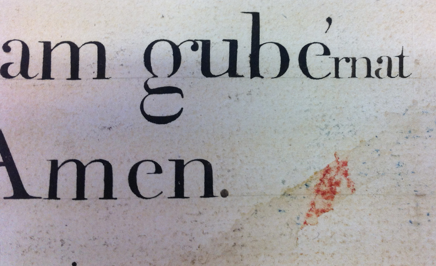
I am intrigued by the shape of the letterforms found in these works. The capital letterforms above (Figure 2) have swelling main strokes, an extreme stroke contrast and a vertical axis (interestingly similar to the characteristics to what is described as the first modern roman typeface which appears in 1784 ‘type Didot’).

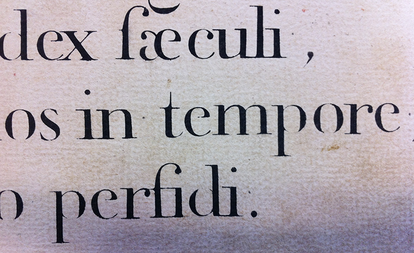
The capitals in red, in Figure 4 above, appear to be a form of Versal. We can see the serifs on the lower-case characters are horizontal; characteristic of the modern roman that was to come. Yet, notice the use of the long s and the t (which to my view, has a bit of a humanist flavour). François (2010) asks what I find to be some very interesting questions: Has the cutting of stencilled letters, in some way caused, the letter axis to become vertical? Have stencilled letterforms and typographic characters developed independently? These questions deserve to be answered.

These choir books show musical notations that are also stencilled (Figures 7, 8 & 10). Notice there are two styles. In the various works consulted so far—particularly Cistercian antiphonals—I have noted five different styles of notation. I hope to write more on this at some later date. In Figure 7, just below, we can see the remnants of the layout technique: guidelines in lead pencil and registration points which are meant to guide placement of letters horizontally. These registration points are meant to be covered by the letter that follows; notice for example the one protruding on the left side of the letter i.




This overview is just a peek into the world of the stencilled liturgical book. Much remains to be discovered and told.


